
Thomas Galvin
Economist | Data Analyst | Content Creator
About
Commercial real estate economist & data analyst with 15+ years of experience in translating macroeconomic, demographic and
policy trends into actionable insights.Core Competencies
Economic model building, data analysis and exploration, statistical knowledge, creating dashboards and reports, continuously improving business processes using automation, communication and presentation of complex topics in an engaging and professional manner.Education
M.A Economics, University Of Nevada, Las Vegas,
B.S. Psychology Calpoly, San Luis ObispoSkillsForecasting & econometrics, white paper authorship, Excel, Power BI, Powerpoint, Word, Costar, REIS, RCA, VBA, SQL, DAX,
M Code, MSCI, Lexis-Nexis, BLS, FRED, statistical analysis, ArcGIS, ProCalcInterested? Get in touch!
Contact
If you'd like to chat about me joining your research team please send me an email using the contact information is below.Otherwise, I invite you to check out my LinkedIn & Substack
where I post economic content & commentary.
Portfolio
Selected White Papers
Data Model Examples
Selected News Articles
Time Series Date Table In Power Query
I’m a big fan of the Kimball method of Data Warehousing, and the cornerstone of any great data model is a proper date table. It links the rest of your model together, will save time in setting up visualizations and allow the proper use of date functions. When it is missing or bad, you will (or should) notice.The table I have been using for years is a modified version of Matt Allingtons date table, so it is reusable and always up to date.There is a twist however.We are going to incorporate NBER based Recession Indicators for the United States into our date table. This data is going to be pulled from the FRED website and will allow us to populate our time series visualizations with the recession bars that are ubiquitous in time series charts. We will then always have the option of adding recession bars into our front end visuals.This will all be handled in a single Power Query for the date table.The first step is to get the recession indicator data from the FRED website. These are 1 for recession and 0 otherwise, a binary variable.

The next step is to get the CSV data from the website and shorten the URL to exclude the start and end dates. We will turn those dates into numbers and drop anything before 1900. This is due to how dates are handled in excel. Anything prior to 1900 will show as a negative number, which will need to be addressed if you want to go back before the 1900's. We will just leave that data off.One trick with Power Query is we can call in multiple sources into one query, keeping the code nice and tidy. To differentiate between our multiple sources, we will be adding R to the end of our steps to signify it came from our Recession time series. All steps in that subquery we will also add R to the end to make sure the steps remain separate. It is also critical that we use the daily frequency in the URL since a data table needs to include all dates.
Lastly, we will use our normal date table steps to create a dynamic table that starts 1/1/1900 (to avoid those negative dates) and ends with the current (dynamic) date, creating fields for year, month, weeks, quarter, ect. If used for forecasting, it will be necessary to add the appropriate time into the future for your end date.Lastly, we will merge the date table with itself to pull in the FRED recession data, giving us the recession indicator field where 1 is a recession and 0 is expansion.
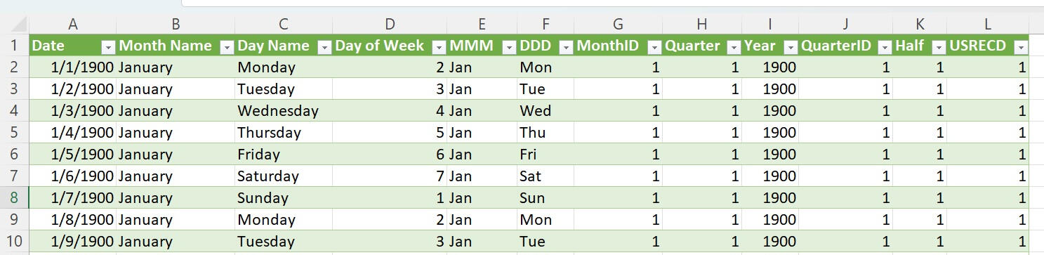
And there we have it. The date table is something nobody will actually see first hand but will feel the effects of throughout the entire process. Lots of sloppy DAX is written to get around a poorly functioning date table and it is just easier to always start from a position of strength to ensure good outcomes. The addition of the QuarterID, MonthID and the recession indicator will make the creation of front end visualizations that much easier. Full code here
BLS Data Model ETL In Power Pivot
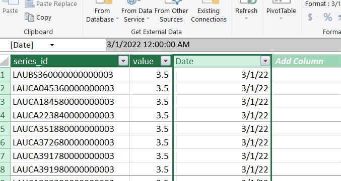
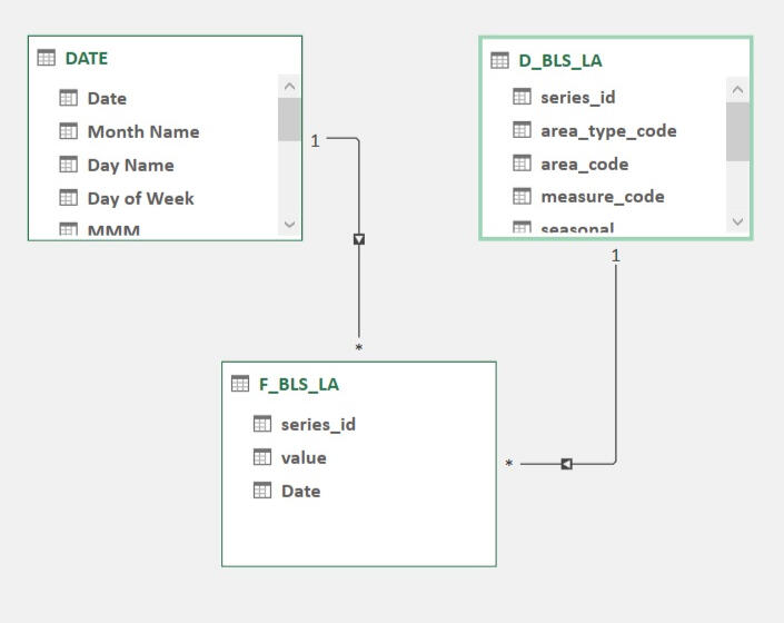
The Bureau of Labor Statistics (BLS) is one of my go-to resources for timely and constantly updated government data. From unemployment rates to the consumer price index, there is a lot of great data series to choose from. And getting that data can be a time consuming and complicated process if you use the front end data tools on the BLS.gov website.Luckily, the BLS publishes its raw data in regularly updated (and properly documented) CSV files here.We are going to build a simple tool that can extract this data in a programmatic manner for one time series, the Local Area Unemployment Statistics (LA). Documentation for this series is here.For the data model, all the BLS tables will fall into a very compact star-schema model. The transaction table is tall, in that it will only contain three columns when we are done with it, Series ID, Period and Value.Likewise, the dimension table is very wide, containing the Series ID, state, metro, industry, measure (labor force info), seasonal adjustments and some meta data. All those fields are contained very neatly in the 20 digit Series ID of which there are about 34,000 of them. This is a very big data series.The final data model will have three tables, the date table joined to the transaction table by period and a dimension table joined to the transaction table by Series ID.After importing our date table, we will add one of the transaction tables (2020 - 2024) and do some transformations. The first is to eliminate the yearly totals, which is M13. Next we need to turn the Month and Year fields into a single date, which we will define as the first of the month in a given year. Once added to our data model it will look like this and be about 1.2 million rows long.
The dimension table will be a bit trickier, as there are multiple smaller dimension tables we will be joining into one (one table for each separate dimension we could filter against). While we could create these tables individually and add them into the model to save disk space (normalize the data), our model will be small enough that we can add them to into the model and join them to one big table to make it easier for humans to read (denormalize the data).We will be using the multiple source trick from the date table example to reduce the number of queries needed to combine the tables. After this, we will have one big dimension table.Lastly, we join our date and dimension tables to our fact table and we have a compact data model for state and area employment statistics.
Local Area employment Model
Here we will take our special date table and the BLS local area labor force numbers from our ETL step to model the data and create a front end visualization.In modeling the data, best practice is to create constructed variables, in this case the unemployment rate, rather then relying on the data given from the data source.In this case, the unemployment rate is a percent, and the model will add up all 50 states unemployment rates to try to produce a national unemployment rate, which will be something like of 300%, which is nonsense. Using constructed variables will ensure that what you get is what you planned to get.So we will construct the unemployment rate variables for the national numbers and the unemployment rate for the state numbers.The unemployment rate is the number of unemployed divided by the labor force. So we will need variables for the number of unemployed (given to us) and for the labor force (also given to us).
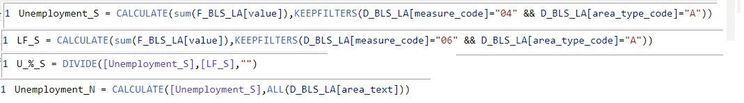
The national variables are the sum of all the state variables, so they are not impacted by filters on our visual.Putting all these elements together, we get a compact visual that compares state unemployment rates to the national unemployment rate with the recession indicators.This will serve as a jumping off point for future visuals and more complex data modeling.The national unemployment rate is the weighted average unemployment rate of the individual states, which is why these two lines move in tandem.However, it is not random; certain states are consistently below the nationwide average (Utah, Colorado, Idaho) and certain states that are usually above the nationwide average (California, Illinois, Washington DC).Future research topics include:What do these states have in common?Are people leaving high unemployment states and moving to lower unemployment states in search of better opportunities?Below is the model. Play around and see what you think.If you'd like to chat about me joining your data team, lets connect
CPI Dashboard - BLS CU Data Series
This is from the CPI data model.The Blue Line and Orange Line in the first tab are the headline CPI numbers. We know what the Orange Line is going to be for the next 12 months, since it is just the Blue Line shifted forward by a year.What happens with the blue line will determine the inflation rate over the next 12 months. Inflation rarely decreases, so if it rises by 3% over the next 12 months it will closely parallel the orange line at the bottom.(Blue - Orange) / Orange = % changeThe second tab shows the Federal Funds Rate, the 2% inflation target and year-over-year inflation.